Introduction to “Get Data from Excel sheet”
This document covers the concept of “Getting Data from Excel sheets” in Power BI services.
Read More
This document covers the concept of “Getting Data from Excel sheets” in Power BI services.
Read More
This document covers the concept of “Difference between Calculated Columns and Measures” in Power BI. This is high level document and assumes that resource has basic knowledge of Power BI Concepts.
Read More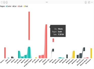
Ribbon chart is used to represent data and easily determine which data category has the highest rank (largest value).This chart is quite efficient at showing rank change.
Read More
This document covers the concept of “Drillthrough Filters” in Power BI Desktop. This is high level document created and assumes that resource has basic knowledge of Power BI Concepts.
Read More
Power BI supports connectivity with SAP Hana Database as backend. With SAP Hana, Information views can be created and used for reporting and analysis purpose.
Read More
This document covers the concept of “Tooltips” in Power BI.Tooltips are the attractive features which allow us to add custom text to provide more detail for data points on a visualization.and which would be useful for the users viewing the visual.
Read More
This document covers the concept of “How to publish the report to Power BI services from Power BI desktop”.
Read More
This document covers the concept of “Parameter” or “Prompts” in Power BI.
Read More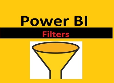
Filters are the kind of “restrictions” or “conditions” applied on the data of the report to restrict unwanted data and show only the data which is desirable.
Read More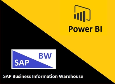
This article is going to focus on connectivity types between Power BI with SAP BW, limitations faced by customer.
Read More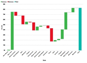
A waterfall chart is a form of data representation that helps in understanding the cumulative effect of sequentially arranged positive or negative values.
Read More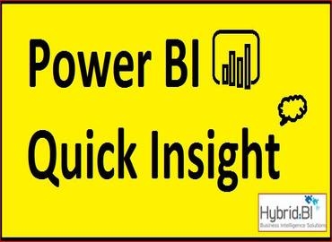
Quick Insight is a sixth sense of data in Power BI. It looks into our datasets and take the possible intuition out and display it.
Read More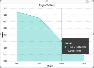
This document covers how to Area Chart in Power BI Service. This is high level document and assume resource has basic knowledge of Power BI Concepts.
Read More
Custom visuals are created by developers, using the custom visuals SDK, to enable business users to see their data in a way that fits the business best.
Read More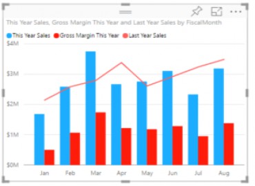
Power BI offer a single visualization that combines a line chart and a column chart. This combo chart will help us to make quickly comparison of data.
Read More
This document covers how to use TOP N dynamically in Power BI Service. This is high level document and assume resource has basic knowledge of Power BI Concepts.
Read More
This document covers how to select components in Power BI by using “Buttons and Bookmarks”. This is high level document and assume resource has basic knowledge of Power BI Concepts.
Read More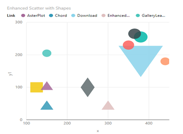
The scatter chart is a type of chart which uses Cartesian coordinates to display values for a set of data for typically two variables.This is also called Scatter Plot, Scatter Diagram or Correlation Chart.
Read MoreCopyright ©2019 Hybrid BI Solutions Ltd. All Rights Reserved